> ## Documentation Index
> Fetch the complete documentation index at: https://docs.mzizi.dev/llms.txt
> Use this file to discover all available pages before exploring further.
# Mzizi Dashboard Standard
> One dashboard design for every admin and operator surface in the Bundu ecosystem: the console shell from @bundu/ui, each brand's mineral as an overlay, and a contract for every component.
Owner decision, 4 October 2026: the Nyuchi console shell is **the** dashboard design for the
whole Bundu ecosystem. Every admin and operator dashboard, in every organisation, uses the
same shell and the same components. Only the brand changes: its mineral colour and its
mark. In the owner's words, "the components should also be updated, same as the mzizi
language — every component should have a contract."
This page is the standard. The components are the 31 app components of
[`@bundu/ui`](https://www.npmjs.com/package/@bundu/ui) (`@bundu/ui/app/*`, pure Astro, no
framework under them). Their contracts live in the registry, in
[`mzizi-dev/mzizi-registry` `contracts/`](https://github.com/mzizi-dev/mzizi-registry/tree/main/contracts).
The standard is new. `@bundu/ui` 0.4.x carries it, and npm serves an older
release until the owner publishes the next one. React (`.tsx`) and Rust
(`.rs`) builds exist for seven primitives only; the shell and page patterns
are Astro-only today ([coverage](#contracts)).
## The reference
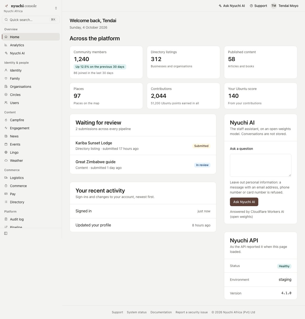
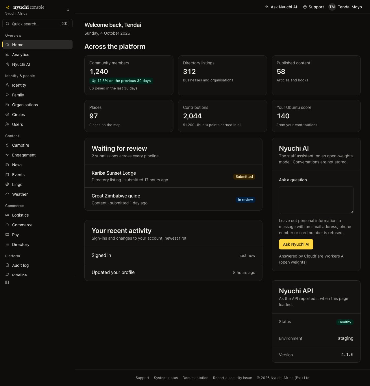
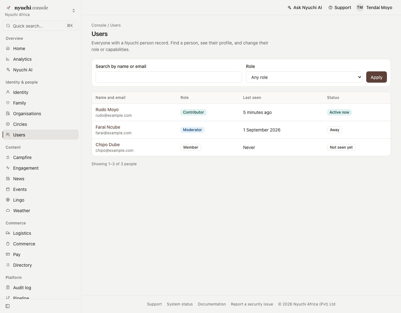
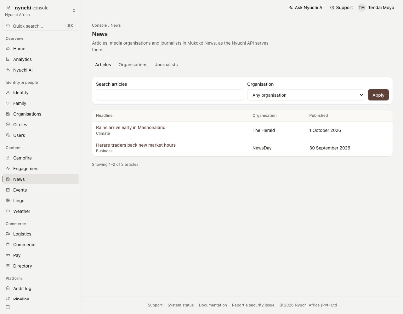
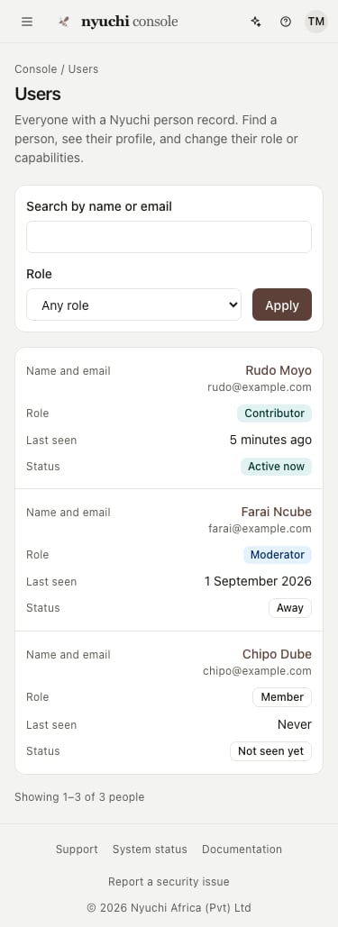
The Nyuchi console, the first dashboard built to the standard. The screenshots were
taken with `@bundu/ui` 0.4.0; from 0.4.1, AppShell's `accent` fills primary actions with the
brand mineral (Nyuchi gold) instead of the deep text variant shown here.
## Anatomy
| Region | Component | What it holds |
| - | - | - |
| Frame | `AppShell` | A fixed 16.25rem sidebar (a 3.5rem icon rail when collapsed) and a main column that fills the rest of the viewport. No centred page container. |
| Sidebar head | `WorkspaceSwitcher` + `BrandMark` | The product's mark and wordmark over the current workspace or organisation. With nothing to switch to, it is a plain link home. |
| Sidebar search | `QuickSearch` → `CommandPalette` | "Quick search…" with a ⌘K / Ctrl+K hint, opening a palette of every navigation item. |
| Sidebar groups | `SideNav` | Quiet group labels (Overview, Identity & people, Content, Commerce, Platform…), one 32px row per item with an icon, nested items under a disclosure, the current item filled with the brand indicator. Descriptions are tooltips, never printed. |
| Sidebar foot | `AppShell` | The collapse toggle. |
| Top bar | `TopBarAction`, `AccountMenu` | A 48px bar: the menu button and the mark below 64rem, then actions ("Ask Nyuchi AI", "Support") and the account menu, right-aligned. |
| Page header | `PageHeader` | Breadcrumbs, the page's one `
` (20px), a "View docs" pill, one line of description, page actions. |
| Toolbar | `Toolbar`, `ToolbarMenu`, or `FilterBar` | Search and filters as a GET form, so every filtered view is a URL. |
| Stat tiles | `StatTiles`, `StatTile`, `InfoTip` | Headline figures as a description list. Trends in words ("Up 12.5% on the previous 30 days") with a short badge; a missing value reads "Not available", never 0. |
| Content cards | `Card`, `DataTable`, `DetailPanel`, `FormLayout` + `FormField`, `BarChart` | Tables become one card per row on phones; charts carry their figures in a real table. |
| Empty and other states | `EmptyState`, `StateMessage`, `Skeleton`, `Toast` | Empty, error, not configured, unavailable and loading, worded once; flash messages in a polite live region that waits to be dismissed. |
| Footer | `AppShell` `footerLinks` | Support, status, documentation, security, copyright. |
## Density
Dashboards are dense on a mouse and generous on touch. Every interactive control declares
both heights, and its contract checks them.
| Control | Fine pointer | Coarse pointer (touch) |
| - | - | - |
| Nav row, quick search, toolbar menu, top-bar action, account menu, page link | 32px | 44px |
| Button `md` / input / select | 36px | 48px |
| Button `sm` / `lg` | 32px / 40px | 44px / 48px |
| Command palette result | 36px | 44px |
| Top bar | 48px | 48px |
| Text | 14px (`text-body-sm`) | 16px (so iOS never zooms an input) |
Corners use the small radius, not the marketing pill. Three controls are under 44px on touch
today and are recorded as gaps in their contracts: the sidebar collapse toggle (32px), the
"View docs" pill (24px) and the info tip (32px). All three meet WCAG 2.2's 24px minimum.
## Brand overlays
The layout never varies by brand. A brand changes colour and mark, and nothing else.
1. **One overlay stylesheet**, imported after the tokens: it repoints `--primary` and
`--ring` to the brand's mineral.
2. **`AppShell accent=""`** (from 0.4.1) fills primary actions and the current nav
indicator with the mineral's brand fill (`--color--brand`, text
`--color--on-brand`). Text links and the focus ring keep the contrast-safe
`--primary` and `--ring`.
3. **`BrandMark`** shows the brand's official mark, the registry's icon pair, never redrawn.
The mineral is the brand's row in the ecosystem table (`mzizi_get_tokens` with family
`ecosystem`, or `GET https://api.mzizi.dev/v1/brand` `.ecosystem`):
| Brand | Mineral | Overlay |
| - | - | - |
| nyuchi | gold | `brand-nyuchi.css`, `accent="gold"` |
| mukoko | tanzanite | `brand-mukoko.css`, `accent="tanzanite"` |
| bundu | copper | `brand-bundu.css`, `accent="copper"` |
| shamwari | sodalite | `brand-shamwari.css`, `accent="sodalite"` |
| Mzizi | hematite (a heritage tone) | `brand-mzizi.css` |
| nhimbe, campfire | malachite | `brand-nhimbe.css`, `brand-campfire.css` (proposed) |
| lingo | cobalt | `brand-lingo.css` (proposed) |
| bushtrade | gold | `brand-bushtrade.css` (proposed) |
The sub-app overlays marked proposed are in review in
[mzizi-dev/packages-npm#24](https://github.com/mzizi-dev/packages-npm/pull/24), with Mukoko
News and Weather. Mzizi's hematite is a heritage tone, so AppShell's `accent` (which takes
the seven minerals) does not apply to it; its overlay sets `--primary`.
Status colours do **not** follow the brand: success is malachite, warnings gold, errors
terracotta or the destructive token, and information cobalt, in every brand. Each
component's contract lists the status colours it may use, and its tests fail on any other
mineral class or any literal colour value.
## Accessibility baseline
Every component's contract lists its roles, keyboard behaviour, focus handling, ARIA and the
WCAG 2.2 criteria it is built to meet. Across the standard:
* **Landmarks.** The sidebar is a named `
 ## Anatomy
| Region | Component | What it holds |
| - | - | - |
| Frame | `AppShell` | A fixed 16.25rem sidebar (a 3.5rem icon rail when collapsed) and a main column that fills the rest of the viewport. No centred page container. |
| Sidebar head | `WorkspaceSwitcher` + `BrandMark` | The product's mark and wordmark over the current workspace or organisation. With nothing to switch to, it is a plain link home. |
| Sidebar search | `QuickSearch` → `CommandPalette` | "Quick search…" with a ⌘K / Ctrl+K hint, opening a palette of every navigation item. |
| Sidebar groups | `SideNav` | Quiet group labels (Overview, Identity & people, Content, Commerce, Platform…), one 32px row per item with an icon, nested items under a disclosure, the current item filled with the brand indicator. Descriptions are tooltips, never printed. |
| Sidebar foot | `AppShell` | The collapse toggle. |
| Top bar | `TopBarAction`, `AccountMenu` | A 48px bar: the menu button and the mark below 64rem, then actions ("Ask Nyuchi AI", "Support") and the account menu, right-aligned. |
| Page header | `PageHeader` | Breadcrumbs, the page's one `
## Anatomy
| Region | Component | What it holds |
| - | - | - |
| Frame | `AppShell` | A fixed 16.25rem sidebar (a 3.5rem icon rail when collapsed) and a main column that fills the rest of the viewport. No centred page container. |
| Sidebar head | `WorkspaceSwitcher` + `BrandMark` | The product's mark and wordmark over the current workspace or organisation. With nothing to switch to, it is a plain link home. |
| Sidebar search | `QuickSearch` → `CommandPalette` | "Quick search…" with a ⌘K / Ctrl+K hint, opening a palette of every navigation item. |
| Sidebar groups | `SideNav` | Quiet group labels (Overview, Identity & people, Content, Commerce, Platform…), one 32px row per item with an icon, nested items under a disclosure, the current item filled with the brand indicator. Descriptions are tooltips, never printed. |
| Sidebar foot | `AppShell` | The collapse toggle. |
| Top bar | `TopBarAction`, `AccountMenu` | A 48px bar: the menu button and the mark below 64rem, then actions ("Ask Nyuchi AI", "Support") and the account menu, right-aligned. |
| Page header | `PageHeader` | Breadcrumbs, the page's one `