@bundu/ui (@bundu/ui/app/*, pure Astro, no
framework under them). Their contracts live in the registry, in
mzizi-dev/mzizi-registry contracts/.
The standard is new.
@bundu/ui 0.4.x carries it, and npm serves an older
release until the owner publishes the next one. React (.tsx) and Rust
(.rs) builds exist for seven primitives only; the shell and page patterns
are Astro-only today (coverage).The reference
The Nyuchi console, the first dashboard built to the standard. The screenshots were taken with@bundu/ui 0.4.0; from 0.4.1, AppShell’s accent fills primary actions with the
brand mineral (Nyuchi gold) instead of the deep text variant shown here.
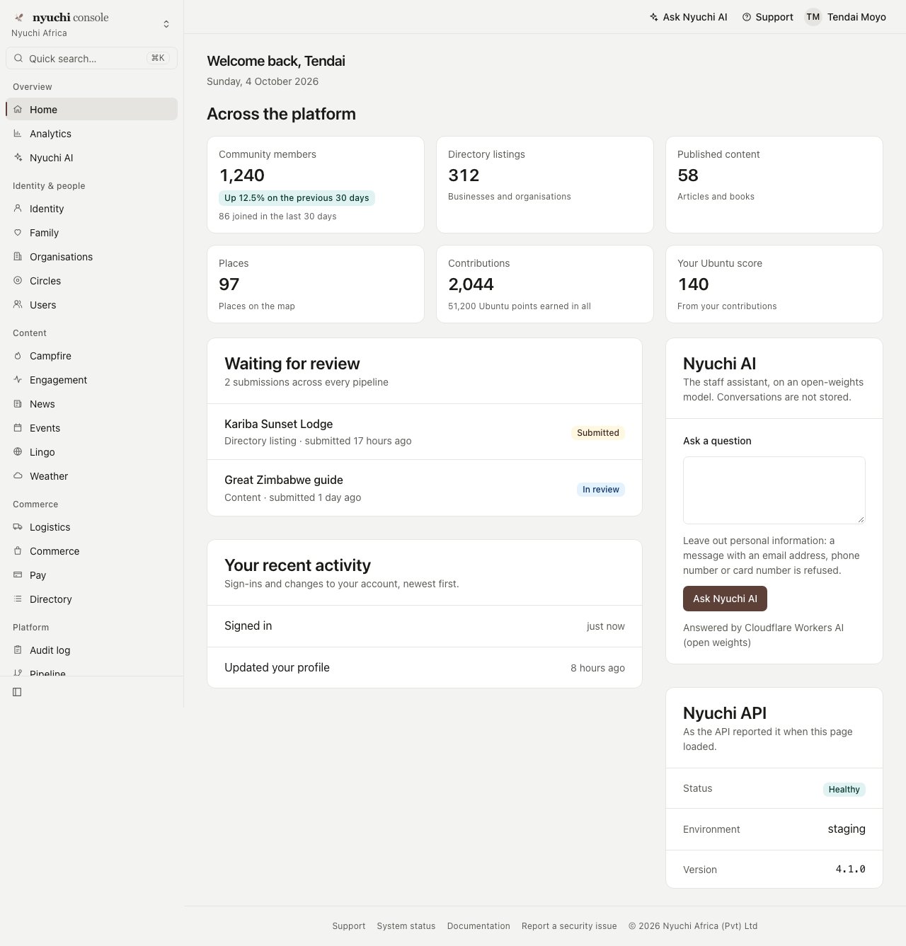
Home at 1280px, light. Sidebar: workspace switcher, quick search (⌘K), grouped navigation with the current item marked. Main column: top bar, page header, stat tiles, content cards, quiet footer.
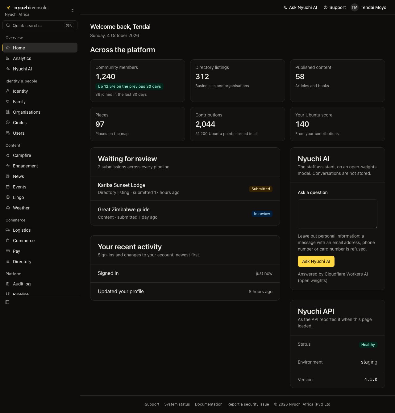
The same page in dark mode. The layout is identical; only tokens change.
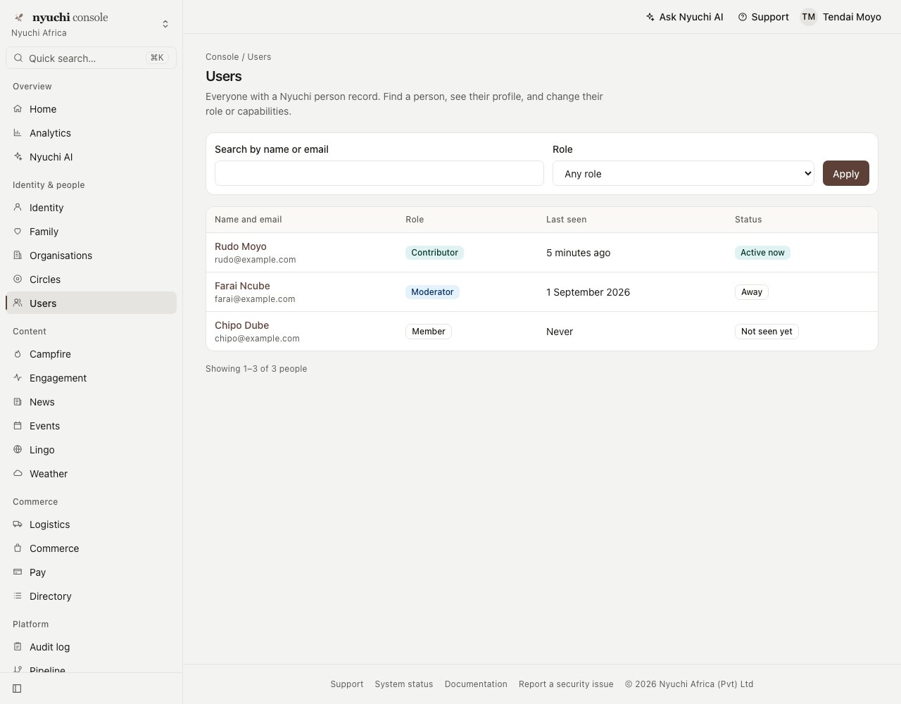
A list page: page header with breadcrumbs, a filter bar as a GET form, a data table, and the pagination summary.
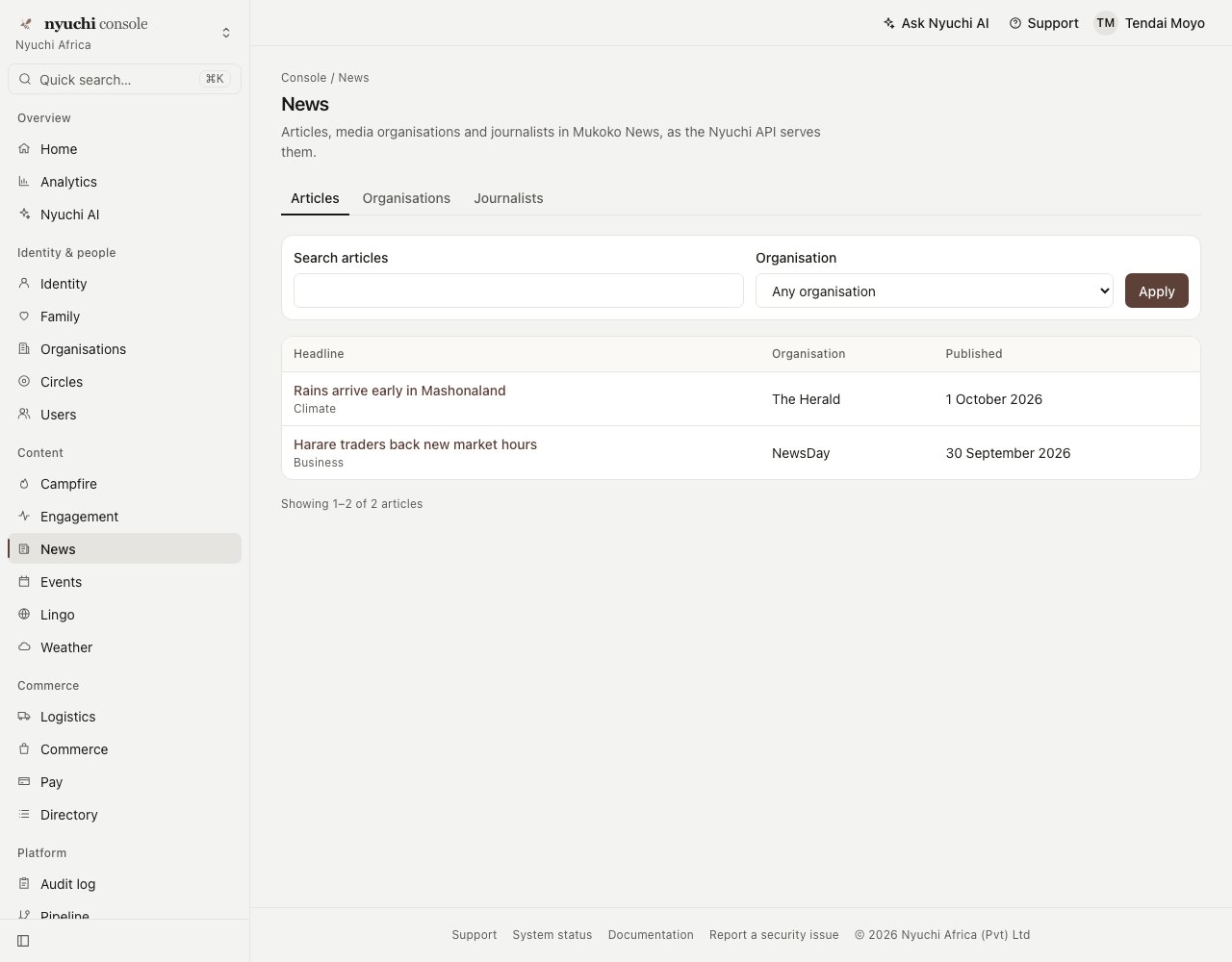
A list page with tabs, at 1280px.
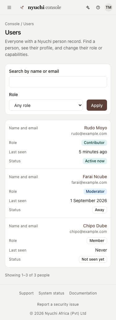
The Users page at 375px. The sidebar is a drawer behind the menu button; each table row is a card with its column names; nothing scrolls sideways.
Anatomy
Density
Dashboards are dense on a mouse and generous on touch. Every interactive control declares both heights, and its contract checks them.
Corners use the small radius, not the marketing pill. Three controls are under 44px on touch
today and are recorded as gaps in their contracts: the sidebar collapse toggle (32px), the
“View docs” pill (24px) and the info tip (32px). All three meet WCAG 2.2’s 24px minimum.
Brand overlays
The layout never varies by brand. A brand changes colour and mark, and nothing else.- One overlay stylesheet, imported after the tokens: it repoints
--primaryand--ringto the brand’s mineral. AppShell accent="<mineral>"(from 0.4.1) fills primary actions and the current nav indicator with the mineral’s brand fill (--color-<mineral>-brand, text--color-<mineral>-on-brand). Text links and the focus ring keep the contrast-safe--primaryand--ring.BrandMarkshows the brand’s official mark, the registry’s icon pair, never redrawn.
mzizi_get_tokens with family
ecosystem, or GET https://api.mzizi.dev/v1/brand .ecosystem):
The sub-app overlays marked proposed are in review in
mzizi-dev/packages-npm#24, with Mukoko
News and Weather. Mzizi’s hematite is a heritage tone, so AppShell’s
accent (which takes
the seven minerals) does not apply to it; its overlay sets --primary.
Status colours do not follow the brand: success is malachite, warnings gold, errors
terracotta or the destructive token, and information cobalt, in every brand. Each
component’s contract lists the status colours it may use, and its tests fail on any other
mineral class or any literal colour value.
Accessibility baseline
Every component’s contract lists its roles, keyboard behaviour, focus handling, ARIA and the WCAG 2.2 criteria it is built to meet. Across the standard:- Landmarks. The sidebar is a named
<aside>, the top bar a<header>, the page is in one<main id="main" tabindex="-1">(the skip-link target), and the footer is a<footer>. Navigation, breadcrumbs and pagination are named<nav>s. - One
<h1>per page, in the page header; empty states and panels use real headings at the level you give them. - Keyboard. Everything works with the keyboard: disclosures are
<details>, the drawer and the palette are Popover API elements (Escape and a click outside close them), and ⌘K / Ctrl+K opens the palette. - Focus. A visible
--ringfocus ring on every control. - Current location.
aria-current="page"on the current nav item, crumb and page link. - Tooltips (nav descriptions, info tips) show on hover and keyboard focus, are the control’s accessible description, and Escape hides them (WCAG 1.4.13).
- Meaning is never colour alone. Trends are written out; badges carry text; charts have a figures table.
- No timeouts. Toasts wait to be dismissed (WCAG 2.2.3).
- Touch targets of 44–48px on a coarse pointer, with the three recorded exceptions above.
Without JavaScript
The standard is server-rendered HTML that works with no script: navigation, the drawer, collapse, disclosures, filters, paging, forms and toast dismissal all use HTML and CSS (<details>, the Popover API, checkboxes and :has(), GET and POST forms). Two components
carry one small script each, as enhancement only:
- AppShell: saves the collapse choice to a cookie, and lets Escape hide tooltips.
- CommandPalette: the ⌘K shortcut, live filtering with an announced match count, Enter
for the first match, and arrow keys. Without it, every result is a link and, with
action, the search box submits to your server.
Contracts
Each component has a machine-readable, versioned contract,contracts/app/<name>.contract.json, in the format
contracts/schema/component-contract.schema.json. Component contracts
documents the format field by field, the clause subset, versioning, and how to change one. A
contract states:
- props and slots with types, behaviour, and named states (fixtures every implementation is rendered in);
- accessibility, density (fine and coarse pointer), theming and the no-JS fallback;
- responsive rules;
- a
contract … endblock in the Mzizi language’s clause grammar (see RFC-0006); - selector checks on the rendered markup.
These are package test suites, not the language’s
mz contract: no component is written in
Mzizi yet. The contract text uses the language’s grammar so that it can be checked by mz contract once components are.
The 24 shell and page patterns have no React or Rust build yet. That work is tracked in
mzizi-registry#397 (an Astro
target in the registry) and #401
(Rust ports); a port is done when it passes the same contract. The full coverage table is
in contracts/README.md.
How to adopt
1
Install
2
Import the tokens and your brand's overlay
3
Describe your navigation as data
4
Wrap every signed-in page in AppShell
5
Build pages from the patterns
PageHeader first, then a Toolbar or FilterBar, StatTiles, and content in Card,
DataTable, DetailPanel or FormLayout. Use StateMessage for every empty, error and
loading state rather than writing your own.@bundu/ui, in the same
change.