@bundu/ui (@bundu/ui/discover/*, pure Astro,
no framework and no client JavaScript). Their contracts live in the registry, in
mzizi-dev/mzizi-registry contracts/discover/.
Tracking: mzizi-registry#413.
The standard is new. The components ship in the next
@bundu/ui release; npm serves 0.2.0
until the owner publishes it. The builds are Astro only: news, events and weather are
Next.js apps today, and adopt the standard when they move to Astro or into the super-app on
the web (their adoption issues say how).The reference
circles.mukoko.com, the first site built to the standard. Its pages are Astro shells that a Rust Worker fills with live data, so it also shows the components working in a server-filled template.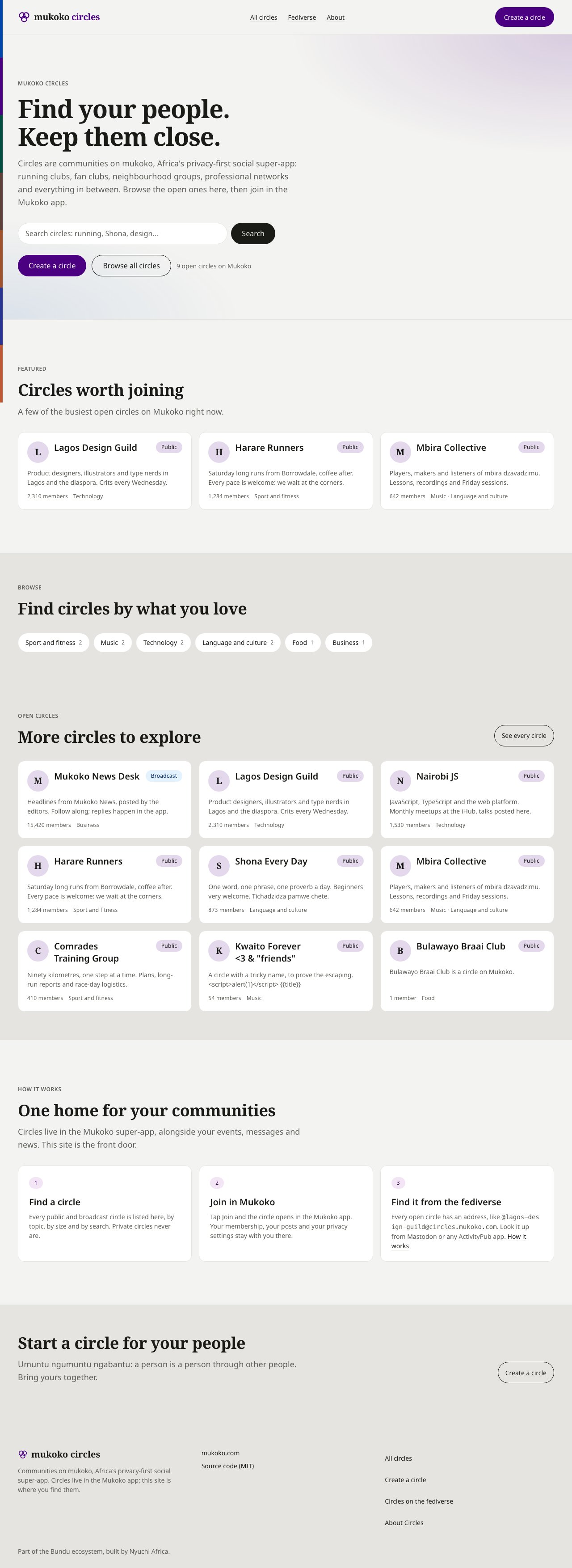
Home at 1280px: header, hero with search and actions, a featured section, category chips, more circles with "See every circle".
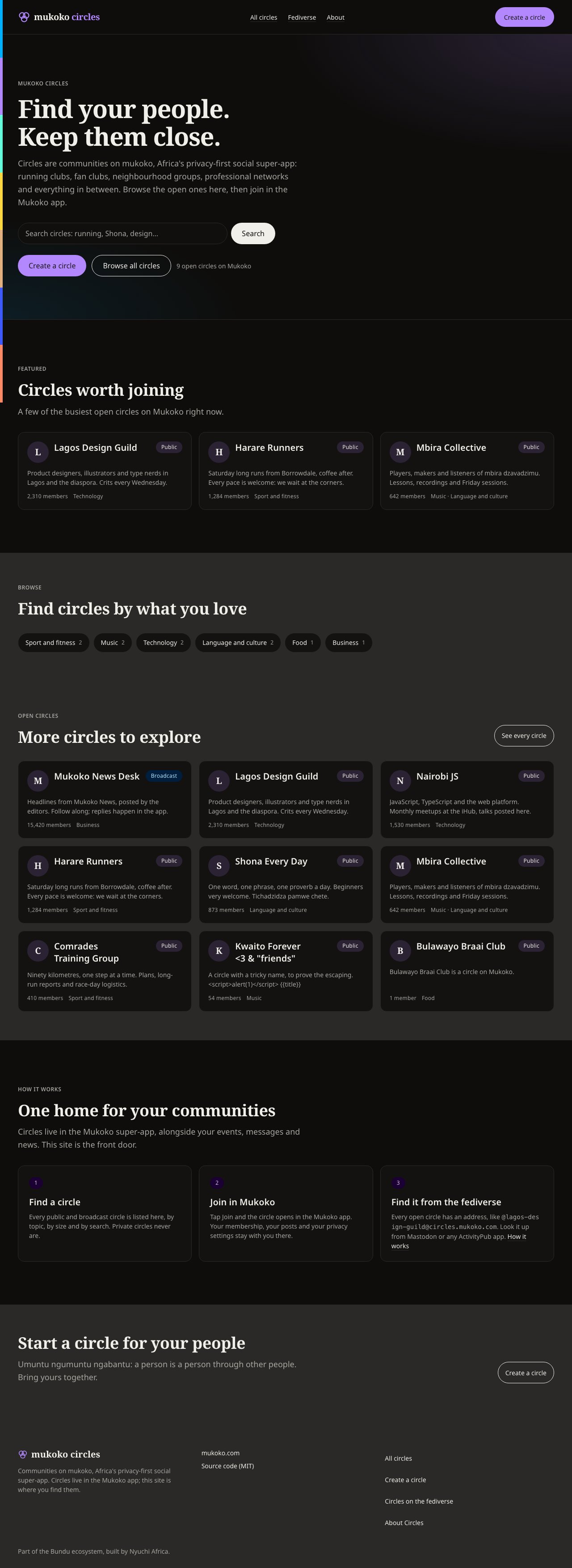
The same page in dark mode. Only tokens change.
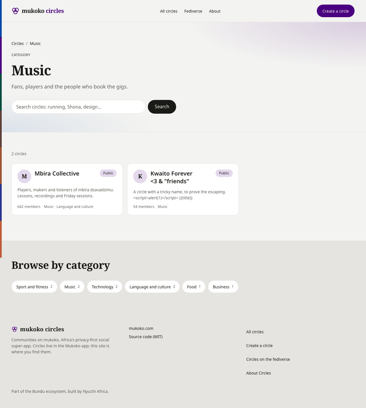
A category page: breadcrumbs, the hero with the search box, the result grid with its status line, then the categories.
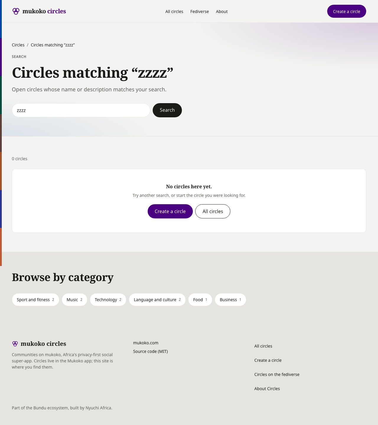
Search with no results: the empty state, the Dashboard Standard's EmptyState in ResultGrid's empty slot.

All circles at 375px. The navigation wraps under the brand; cards stack; nothing scrolls sideways.
Anatomy
A page is always:
DiscoverMeta in <head>, then DiscoverShell → DiscoverHero (with
DiscoverSearch) → one or more DiscoverSections, each holding a ResultGrid of
DiscoverCards or CategoryChips. A featured rail is a DiscoverSection holding a
ResultGrid.
One card
DiscoverCard is one contract with four variants. They share one anatomy and change emphasis,
never structure:
The title is a heading holding the card’s one primary link, stretched over the whole card; other
actions sit above it and stay separately focusable.
external marks a link to a news source
(rel="external noopener"). Badge tones are neutral, brand, info, success, warning and
danger; the status tones use the status minerals, so they mean the same in every brand.
Behaviour every Discover page shares
- URLs, not client state. Search is
?q=, a category is a path or?category=, paging is?cursor=. Every view can be linked, cached and opened without JavaScript. - Cursor paging.
LoadMorelinks to the next page; there are no page numbers. Pages past the first and search results arenoindex(DiscoverMeta noindex). - No client JavaScript, no inline styles. The components ship neither, and their tests fail
on a
styleattribute, so a site can run withscript-src 'none'andstyle-src 'self', as circles.mukoko.com does. JSON-LD is data, not script. - “Open in Mukoko” is an https link: a universal or app link, or a server redirect such as
circles.mukoko.com’s
/c/{slug}/join. It opens the app where it is installed and the web otherwise. A baremukoko://link does nothing without the app, so it is never thehref. - SEO. Title “<page> · <Service>” (the home page “<Service>: <promise>”),
en_GB, a 1200×630 image. JSON-LD:WebSitewith aSearchActionon the home page;CollectionPage→ItemListand aBreadcrumbListon lists.
Server-filled shells
circles.mukoko.com builds each page once with{{placeholders}}, and its Rust Worker fills them
per request. Every Discover component works that way, so the design stays in Astro and the
logic in Rust:
- every text prop is a plain string, and text that fills to
""hides itself (empty:hidden); - state switches are attributes styled by classes:
ResultGrid state,DiscoverSection state,LoadMore state,DiscoverCard badgeTone(data-tone),CategoryChip current(aria-current, which accepts"false"); DiscoverCardandCategoryChiprender their own<li>, so they can be repeated as fragments.
template state with placeholders where this matters.
Density, brand and accessibility
Discover pages are public and touch-first, so controls are the same size on every pointer: the search field and its button, “See all”, “Load more” and “Open in Mukoko” are 48px; chips, navigation links and the home link are at least 44px. The layout never varies by brand. A brand changes the overlay stylesheet (--primary and
--ring, its mineral) and the brand slot (its mark). The hero wash, the card monogram, the
brand badge tone and primary buttons follow --primary; nothing else does. The brand
overlays are the same as the Dashboard Standard’s:
brand-mukoko.css for the super-app and circles, brand-news.css, brand-events.css,
brand-weather.css.
Landmarks are a header, the “Main” navigation, one <main>, named regions for each section, a
search landmark and a footer. Each page has one <h1>, and headings step down without gaps.
The results summary is a polite live region. A rail is keyboard-focusable so it scrolls without
a pointer. Meaning is never colour alone: badges carry text and the current chip is marked
with aria-current.
Contracts
The eleven contracts arecontracts/discover/<name>.contract.json in the registry, in the
same format as the Dashboard Standard’s (Component contracts):
mzizi-dev/packages-npm renders every component in every state and evaluates each clause,
check and density row, the brand-overlay and no-inline-style rule, the no-JS rule, and that the
.astro file’s props and slots are exactly the contract’s. src/discover/discover.test.ts
also renders a whole Discover page and the server-filled mode. No React or Rust build exists
yet; a port is done when it passes the same contract.
How to adopt
1
Install and import the styles
2
Put DiscoverMeta in <head> and DiscoverShell in <body>
3
Build each page from the anatomy
Upstream first
Do not fork a Discover component, restyle it locally or wrap it to change it. A component your page needs that Mzizi does not have, or a change to one it has, goes upstream immediately: its contract in the registry and its build in@bundu/ui, in the same piece of work. An app keeps a
local copy only while that upstream pull request is open, marked at the top of the file with
TODO(mzizi): <pull request URL>, and deletes it when the release is installed. The registry’s
CONTRIBUTING.md holds the rule.
Adopting the standard in circles.mukoko.com did exactly this: a section that hides when its data
is empty (DiscoverSection state), a second action beside “Open in Mukoko” (OpenInApp’s
slot), the .link text-link class, and removing the inline styles that made its CSP allow
style-src-attr 'unsafe-inline' all went into @bundu/ui rather than into the site.